During our annual Crowdynews gathering in February, we were joined by several industry experts who shared their knowledge with our global team. Dr. Mario Garcia, a senior adviser on news design and adjunct professor at Columbia University’s School of Journalism, was one of them. Garcia, who has consulted with over 700 news organizations around the globe such as the Wall Street Journal, Washington Post and Aftenposten, and recently joined our newly formed Advisory Board, shared his views on the state of the media landscape. These are the key takeaways from his speech.
The journalism of interruptions
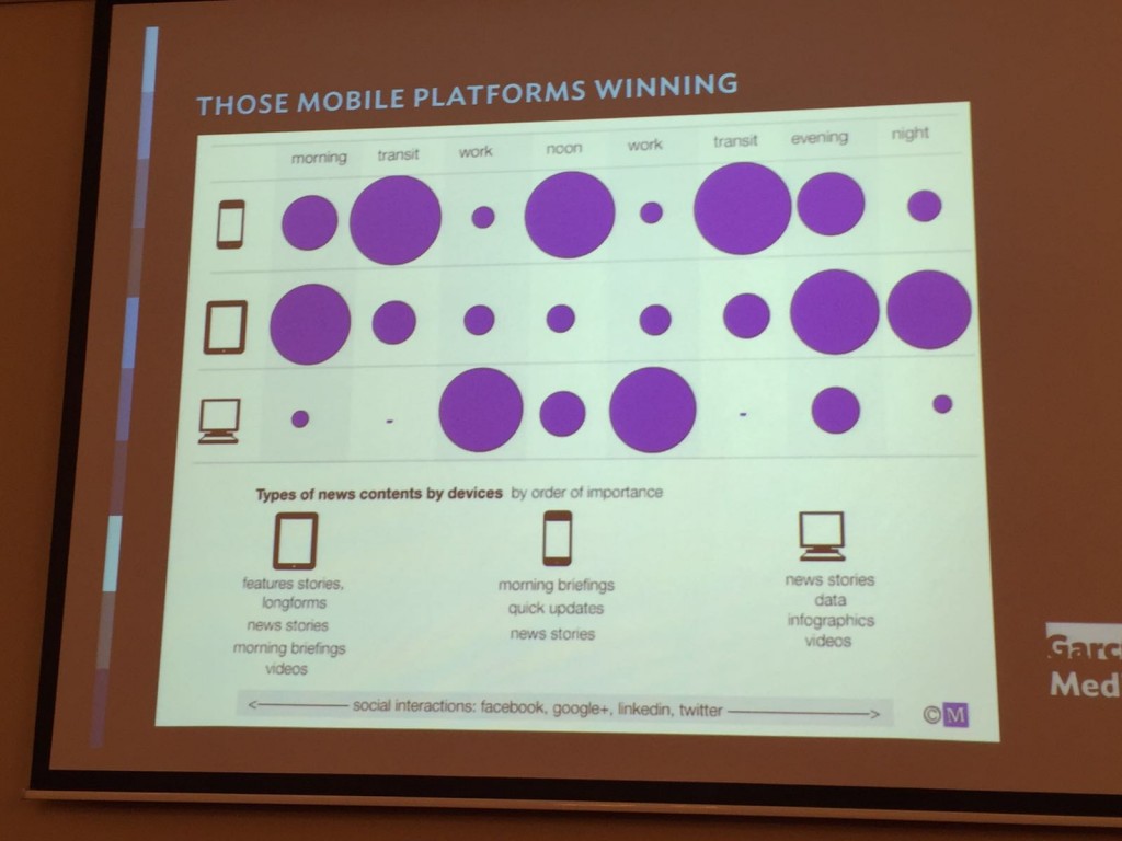
The news cycle has changed tremendously thanks to technology. A few decades ago technology limited the pace of how news was delivered. In the morning, we read newspapers as part of our morning ritual, then we listened to the radio in the car to and from work, and after a long day of work we watched the evening news. There wasn’t much in between. But nowadays we consume news anytime and everywhere we are. Furthermore, thanks to internet, the definition of news has also changed to: “Anything you know now that you did not know 15 minutes or 15 seconds ago.”
Big stories like the death of David Bowie and the El Chapo interview ‘break’ thanks to social media. And whenever something like a plain crash happens, it’s the people on the scene who break the news (via “citizen journalism”) before the mainstream media know about it. Mobile is playing an ever more important role in this equation as we have many more platforms to choose from. It’s what Garcia calls ‘the journalism of everywhereness’. However, due to us being always connected, we only pay partial attention to the news we consume. Thus, in order to capture the reader’s attention journalists need to master ‘the journalism of interruptions’, he adds.
The two tempo environment
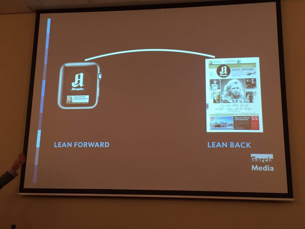
The current cycle of news consumption can be divided into two ‘tempos’, which are strongly related to the mobile usage: lean forward and lean back. Lean forward revolves around active news consumption and is mostly centered around smartphones on which you follow 3-5 stories during the day. Lean backward involves passive consumption and intends to paint the bigger picture, for example through background articles; because they are more intense and longer reads, lean backward news consumption typically occurs at night, on a tablet and is limited to 3-5 stories.
But the digital age not only requires a different frequency, but also a new storytelling philosophy. It’s much more complex and direct. Garcia takes the example of Aftenposten for which he envisioned story segments as components of the whole story package, where the story is being told ‘one beat a time’, depending on when you read the story throughout the day. The story gets built in bit-size pieces throughout the day, although there’s always a summary available within an arm’s length.
Publishers also need to accommodate for readers’ desire for a variety of content – from the serious to the silly. They not only want to read about the latest on refugees in the EU but also about the latest gossip on Beyoncé.
Design for mobile first
The rise of mobile requires a different approach to how we tell stories. Publishers should always design for mobile first, Garcia said. And design should be consistent across every platform. While traditional stories were just headlines and text, mobile stories need to be short and visual instead.
And while the traditional printed newspaper is diminishing fast, print is incorporating some key improvements from mobile, such as the disappearance of a newsy headline, more visual, graphic presentations with photos and illustrations, new patterns for presenting advertising, etc. However, publishers should also prepare for the day when there is no daily printed version of newspapers anymore. Garcia thinks the daily newspaper will eventually disappear, although the weekend will be the winner. He advises news organizations to create a ‘fabulous’ epaper. Simply because they are ‘extremely popular’ with readers.
Little black dress, Chanel #5 and Manolo Blahnik stilettos
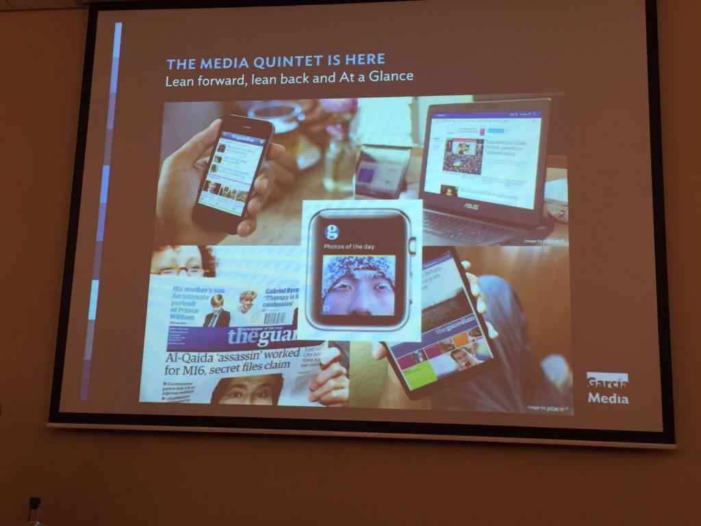
Thanks to smartwatches the ‘era of at-a-glance journalism’ has arrived. Garcia, who is a fan of the Apple Watch, highlights a key phrase Apple used during the introduction of their highly anticipated smartwatch: “Just what matters and nothing else”. This ties back to mastering the journalism of interruptions. For the smartwatch, whose screen is rather small compared to other devices, headlines have ‘never been more important’ in any of the existing platforms. Seducing the reader needs to get to the next level, he says. “They [the story] must wear the little black dress, Chanel #5 and Manolo Blahnik stilettos, and be able to walk the walk without skipping a beat.”
Next to that, images are more important than ever because readers use images to ‘get into’ a story. Publishers need to choose the correct image for each story. “It is highly important”, Garcia stresses once again. But busy images aren’t the way to go. Simple images simply do better. Actually, head shots appear to be the best approach, Garcia concludes highlighting a few examples of the Washington Post, for which he consulted previously. “Keep an eye on them. They’re the most experimental of all big legacy newspapers.” He’s also very fond of business news site Quartz, which masters seducing readers and providing the best summaries, according to Garcia.
Front door or kitchen door
Social media is the number 1 driver of news website traffic as it accounts for more than 30% of all referral traffic. Essentially this means more people arrive through articles directly than through the traditional homepage. However, publishers used to pay more attention to their homepages. To illustrate this, Garcia uses the house analogy: “While we make sure the front door is painted and in perfect shape, everyone comes in through the kitchen door instead.”
Garcia thinks the end of the homepage is near. The year we rethink (or abandon) homepages, he says in one of the Nieman Lab predictions for 2016. Instead he envisions a different approach to improve article pages: the card system, which is essentially a mini version of the homepage that consists of small, visual and contextual updates. These can be either stories, facts & explainers, live tickers or integrated social media. Besides Aftenposten, Quartz and Bloomberg are among the early adopters of this approach. Branding is perhaps more important now than ever before as the article ‘has to maintain the brand’ too. The article page is the new front page. Garcia highlights a quote from Aftenposten Chief Editor Espen Egil Hansen: “We produce a thousand front pages each day.” Aftenposten is one of the more progressive newspapers in Europe, he adds.
Summary
- Because of the readers partial attention to the news due to being always connected (journalism of everywhereness), journalists need to master the journalism of interruptions.
- We live in a two tempos environment for news consumption which requires a different storytelling philosophy across platforms.
- Publishers should design for mobile first and prepare for the day when there is no daily printed version of newspapers – the weekend edition will win.
- Take seducing the reader to the next level and use the right images (head shots) to pull readers into the story.
- The end of the homepage (front door) is near as social drives traffic to article pages (kitchen door) instead – this requires a new approach like the card system where branding is essential too.
Also read: Change Before You Have To


